Premium beverage brand identity covering logo design, packaging design, label specifications, brand guidelines, and market differentiation strategy.
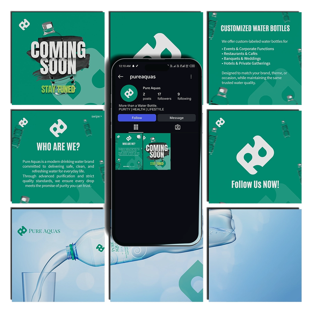
Pure Aquas needed to differentiate in the crowded premium water market where most brands rely on similar blue/white aesthetics. They wanted an identity that communicated purity while standing out on shelves and supporting premium pricing.
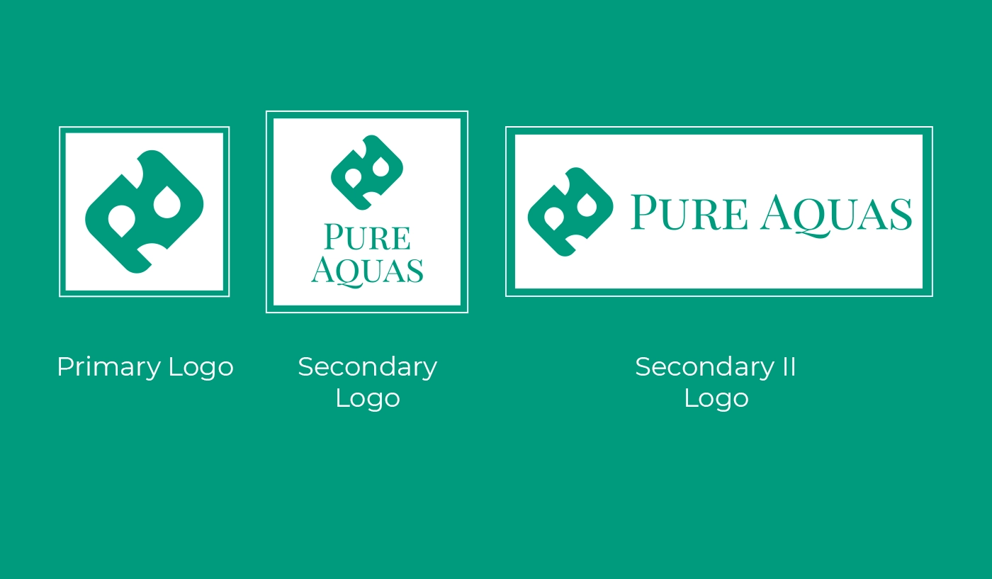
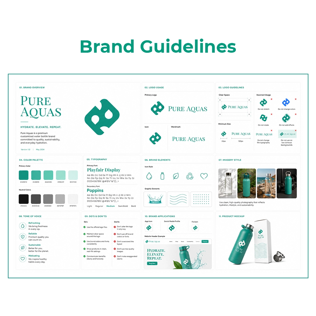
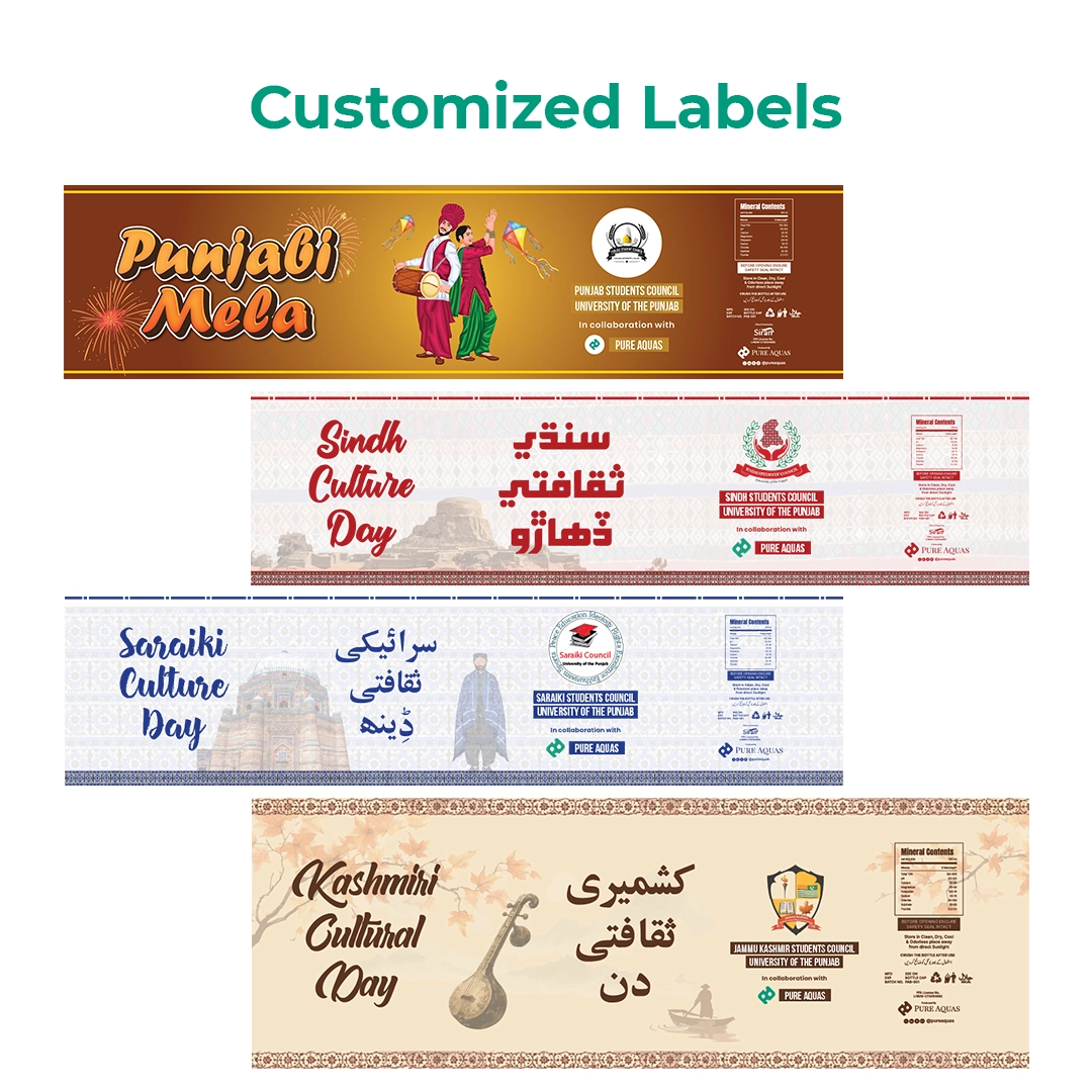
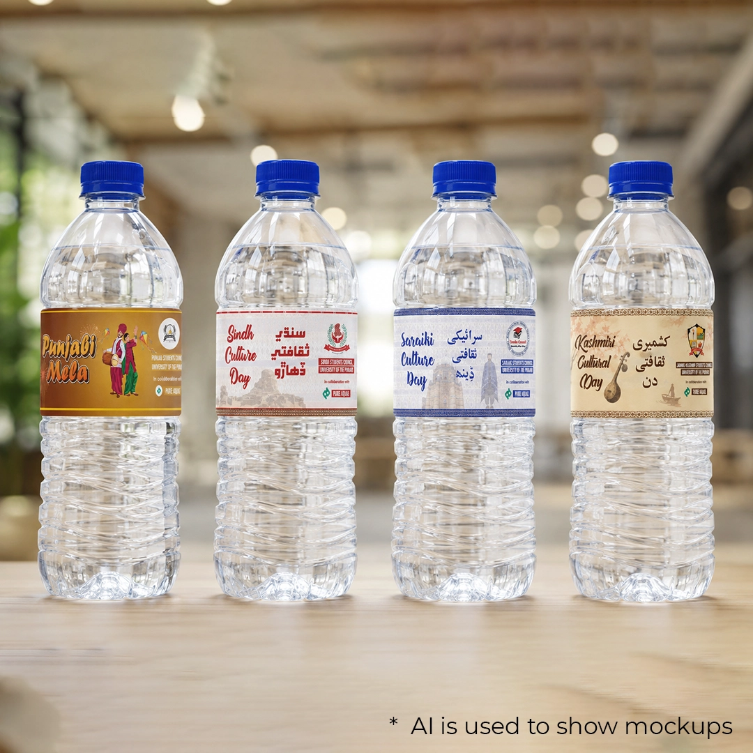
Developed a minimalist yet distinctive identity using an unusual color palette (moving away from typical water blues), elegant typography, and clean packaging design that commands premium pricing. The design balances sophistication with clarity of purpose.
Market analysis → Shelf audit → Concept sketches → Logo refinement → Packaging dieline design → Label specifications → Brand mockups → Print-ready file preparation
Successfully positioned as a premium brand with distinctive shelf presence. Packaging design received positive retailer feedback and supported premium pricing strategy.